After about 15 years, Microsoft finally announced that it is changing the default Office font – Calibri – by next year.
The company first launched “Calibri” font in 2007 to replace Times New Roman, and since then it has been the default font for all things Microsoft. According to Microsoft, the font has served its purpose, hence the change.
“To help us set a new direction, we’ve commissioned five original, custom fonts to eventually replace Calibri as the default. We’re excited to share these brand-new fonts with you today and would love your input”, said Microsoft.
As a way to involve its millions of Office users, the company wants people to choose their favourite fonts to be used as default by tweeting about it.

The five new sans-serif fonts come with a variety of formats, including the traditional, modern, and even one inspired by German road and railway signs. The company is receiving feedback on these five new fonts, starting today, and intends to set one as the new Office default font in the year 2022.
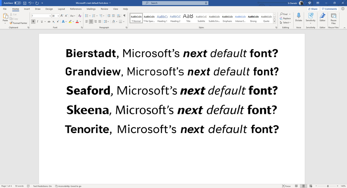
Tenorite, was created by Erin McLaughlin and Wei Huang, is the more traditional style out of the five. It almost looks like a more modern version of the default Times New Roman font from decades ago, with wide characters, accents, and clear punctuation.

Skeena, designed by John Hudson and Paul Hanslow, feels inspired by various periods of font design. It has big variations in the thick and thin parts of its letters, along with very distinct curves on letters like S, A, and J.

Bierstadt by Steve Mattison is inspired by mid-20th-century Swiss typography. The stroke endings are very clearly cut off, but there’s some subtle softening to avoid the rigid grid-based typography you typically find with a font like this. Helvetica is the most famous example of this type of “grotesque san serif” font, and Mattison has attempted to contrast Microsoft’s Arial font here, too. Mattison named the font after a rocky mountain in Colorado that reminds him of the Swiss Alps.
Seaford by Tobias Frere-Jones, Nina Stössinger, and Fred Shallcrass, feels the most immediately familiar out of the bunch, invoking the classic old-style serif text typefaces. The designers took inspiration from old armchairs to find a practical way to bring a classic, valued font back to life without the serifs. I’ve been testing all the new fonts in Word, and this one in particular feels the most comfortable for reading long documents.

Grandview is the most striking of all five new fonts. Created by Aaron Bell, it draws inspiration from classic German road and railway signage. Much like the signs, this font is designed to be highly legible, with some tweaks to make it more comfortable for long-form reading. Based on the spirit of the German industrial standard, Grandview looks like it would work well in PowerPoint slides in particular.
Microsoft is now releasing these five new fonts in Microsoft 365 so everyone can try them out before a new default is chosen. Polls and feedback will be considered as part of how Microsoft picks a winner, and the company is going to spend the next few months evaluating these new fonts and seeing which ones are proving popular. Once a decision has been made, the new default font will appear in Microsoft Office apps in 2022.
Tom Warren at The Verge gave the brief summary of five fonts.
2 Comments
Pingback: Microsoft Finally Introduces 'Dark Mode' for Office App On Android Phones | Innovation Village | Technology, Product Reviews, Business
Pingback: TikTok has launched a new font - TikTok Sans - Innovation Village | Technology, Product Reviews, Business